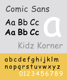
Comic Sans: Satan's Typeface
'The written word endures, the spoken word disappears…'
-Neil Postman
Typography is a modernist's obsession. In it's most basic form, it is a form of illustration, the craft of endowing human language with a durable visual form. Type is what language looks like and typefaces are a visual format for language. The art of typography is not just in the letter forms themselves but also in the way they encode meaning through pace, intonation and emphasis.
Typography has a significant chronology dating back more than 450 years, but in order to fully understand the chronology of type and the cultural shift from oral to written communication one must look all the way back to Ancient Mesopotamia in 3200BCE, an area of the middle east widely regarded as the cradle of Western Civilisation. Western scholars and occidentalists of the time adapted the pictorial Proto-Sinaitic script of the Mesopotamians, to form the foundation of western type.
The Mesopotamians pioneered in taking what was normally reserved as an oral tradition and made it a written one, a process that over time that was adopted by other cultures and forms the basis for western alphabets and written language. The development and acquisition of a durable visual form of language was driven by the desire for trade and commerce and development still is today.
Typography and letterform has always been influenced by the technology of the time and a significant development came in 1450 when Johnannes Gutenberg created the woodblock printing press, giving birth to a range of new type faces. The creation of the printing press was motivated by the proliferation of organised religion and the desire of churches to print more Bibles.
The next major step in the evolution of type was in 1870, when William Foster introduced the Education Act, making education compulsory for all in the United Kingdom, when beforehand, education was a luxury for the privileged few. Education proliferated the need for printed word, as the printed word is key to the process of education, but it was the establishment of The Bauhaus in 1919 by Walter Gropius and other early modernists that brought together the creative minds of the time with industry and commerce, birthing a design culture. The industrialisation of type further proliferated the
printed word and in 1957 Max Miedinger set out to design a new sans-serif typeface born out of the need to create a utilitarian, neutral typeface reflecting a modernist perspective. This is where Helvetica comes from. Helvetica reflects the consumer culture, industrialisation and commercialisation of the post-war world.
This lecture has given me a greater understanding of type and how to apply it effectively, the differences between modernist typefaces and the connotations each one holds.Typographical design is not an area I'm overly familiar with, so the lessons learned in this lecture should prove valuable should I work in a graphic style in the future for my animations. We touched upon the history of Swiss Typefaces, one of the staples of Modernist design philosophy, which I found to be interesting. While I think of myself as quite a figurative animator, I am open to more abstract ideas, Typographical animation being one of them. Even so, this lecture should prove useful in the future, especially on more commercial ventures.

No comments:
Post a Comment