Wednesday, 25 November 2015

Context of Practice Lecture: Consumerism - Persuasion, Society, Brand, Culture


'A new elite is needed to manage the bewildered herd.'

                                                                                                      -Adam Curtis, The Century of the Self

Sigmund Freud, one of the most influential Psychologists in history, at the turn of the 20th Century coined the term Psychoanalysis, a new theory of human nature, highlighting hidden primitive sexual forces and animalistic instincts which need controlling. Freud stated in his various works published between 1899 and 1939 that society represses our natural urges unconsciously and our desires are buried deep in our subconscious, believing in a fundamental tension between civilisation and the needs of the individual. Living through the turn of the century at a time, with the rise of industrialisation and capitalism Freud interpreted the first world war as a social eruption, the result of centuries of repression of human desires.


Freud's nephew Edward Bernays, was a press agent and propaganda officer who after World War 2 set up 'The Council of Public Relations', the birth of PR, based off his uncle's ideas of the Pleasure Principle, which Freud argued is what makes us 'happy and content'. Bernays was employed by cigarette companies to encourage young women to smoke, a contrast to the social taboos of the time. To achieve this he hired women to walk in the 1929 Easter Day Parade as Debutantes and smoke cigarettes in from of press photographers. Berney;s wanted to paint the women walking in the parade as 'suffragettes' lighting up 'torches of freedom'. As a result, cigarette sales went up and today cigarettes are universally associated with desire and glamour, proving that by linking products to desires, you can make people behave against their interests. Bernays used Product Placement, Celebrity endorsements and Pseudo-Scientific reports to promote products.


All this was happening at a time of mass production, with the rate of production in the US rising exponentially. Mass production on this scale lead to mass commodification, which eventually lead to a crisis of overproduction and oversaturation of the market. To combat the arbitrary identity given to commodities in an oversaturated marketplace, individual brands emerged, giving an identity to commodities, making them more desirable to the consumer. Early consumerist branding focused on the merits of products, however over time the focus shifted to how a product can appeal to your individual desires. An early example of this would be Henry Ford's  "Ford Cars' which were marketed as a sort of  status symbol, beginning this sort of cultural myth of cars as a symbol of power and success which persists to this day.


From then on Advertisements focused more on the idea of the product rather than the action function, driven by the need to shift more products in a market oversaturated with different lifestyle brands. Freud's theories describe this as a shift from a 'needs culture' to a 'desires culture', a culture in which people associate different brands and products with success and power. Vance Packard broke the way in which advertisers do this in his book 'The Hidden Persuaders'.

Packard states that advertiser's push their products upon consumers by selling...

  • Emotional Security
  • Worth and reassurance of status
  • Ego Gratification
  • Creative Outlets
  • Love Objects
  • A sense of power
  • A sense of roots
  • Immortality

Consumerism is an ideological project that emerged in the early 20th century as a form of social control. Political commentator Walter Lippman wrote in the 1920s that politicians are incapable of managing society in the 20th century, and that it was the job of PR people to advise those in power how to persuade people to follow their ideological beliefs. In 1940, at the height of the Second World War, Bernays was put in charge of marketing America's technological and cultural dominance at the World's Fair, a centrepiece 'Democracity', a city of the future which would solidify America's superiority over other ideological superpowers such as Nazi Germany and the Soviet Union. This 'city of the future' was nothing more than PR for Capitalist products, funded by big business manufacturers, in an attempt to market their consumerist ideology in response to the rise of socialist ideas in hopes to quash them.

On a personal note, I am more than familiar with the work of Adam Curtis, the documentarian behind 'The Century of the Self'. I find his work both inspiring and incredibly well informed. This sort of anti-consumerist ideology is something I would like to touch upon in my own work at some point in time as I agree quite strongly with people like Curtis on the subject. Freud's ideas as well, particularly regarding psychoanalysis, appeal to me creatively. Overall, I found this lecture to reaffirm a lot of the points made in Century of The Self, and found it to be very inspiring for my own work. Personally, I do not feel there is enough subversive, anti-consumerist animation out there, so it's definitely something I could see myself touching upon in the future. 

Wednesday, 11 November 2015

Context of Practice Lecture: Print Culture and Distribution


According to media theorist Marshall Mcluhan, we are living in the 'late age of print', an age which began around 1450 with the invention of Guttenberg's printing press. Guttenberg's printing press paved the way for a more enlightened society, allowing for new ways to easily share and distribute information through the printed word. Before the invention of the printing press, books had to be hand written, often the luxury of the bourgeious elite. This democratisation of information and the ability to reproduce great works en mass, changed the art world forever, bringing art to the masses.

Up until this democratisation of print, art was seen as property of the elite, commissioned by the elites and aristocracy of society, often depicting them in a positive light as a way of consolidating their power. Industrialisation brought on by the industrial revolution gave disillusioned members of the working class a means of producing art and print. Thousands moved from rural areas to the inner cities where the industry was, and this condensation of population lead to a condensation of culture. Disillusionment with bourgeouis institutions such as the Royal Academy of Arts leads to the working classes developing their own culture, much to the dismay of the upper classes and a popular culture of people's art, political satire, chartism and various social movements begins to emerge.


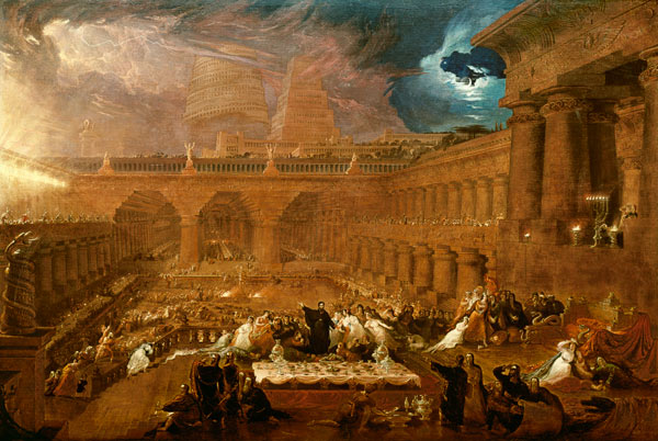
One of the early examples of  a middle class, mini entrepreneur was John Martin (1820) with his painting Belshazzar's Feast. Martin did not attend any elitist art academies and was seen as an outsider in the art world at the time. He produced and sold copies and prints of his paintings using the new technologies available at the time and proved more money could be made through the mass production of art. This market allowed the everyman to own copies of art, made possible by urbanisation, though works chosen for reproduction were often simple and easy to reproduce.

Real change came with the establishment of the School of Design- Somerset House in 1836, a school of 'design' rather than art, that taught art in the context of mass popular culture rather than in the culture of the traditional elite. This development can be seen as a part of a wider cultural shift at a time where entrepreneurial middle class capitalists were at the centre of government rather than the traditional royal elites.

The ruling class at this time felt threatened by these developments, as they saw themselves as the guardians of culture. To elitists like poet and cultural critic Matthew Arnold, working class culture was a threat to traditional hierarchies. Arnold saw art as 'the study of perfection', while working class culture was seen as 'anarchic'. Many in the elite of society wanted culture to be disinterested, unquestioning of the status quo, for example through the study of abstract concepts such as beauty. At this time for the elites, culture is about pacifying and policing the working class masses, an ideological weapon of the ruling class. Working class culture in the 19th century, while often dismissed by the ruling class, was seen as culturally relevant to the masses and could also be used as a weapon by the working class to challenge the status quo.


This elitism carried on through to the 20th Century, with literary critics such as F.R Leavis who saw the time as a period of cultural decline due to the proliferation of mass culture vs 'proper culture'. Marxist philosopher and cultural critic Walter Benjamin wrote about 'The Work if Art in the Age of Mechanical Reproduction' (1936). Benjamin saw art as a weapon to challenge concepts associated with Fascism and states that Technological Reproduction of art removes...

Creativity
Genius
Eternal Value
Tradition
Authority
Authenticity
Autonomy
Distance Mystery

All of these disparate elements make up the aura of a work. Benjamin argues that this sort of way of thinking is what makes fascism possible, as it makes the downtrodden accept their circumstances and be subservient to an elite. By removing the aura form art, by reprinting it, disseminating and proliferating it, it rejects this authoritarian culture. Print culture is the culture of the people, as it allows them to challenge authority and to rewrite the world. Ultimately, as cultures aura diminished, hierarchical power in culture also diminished.


In 1962, Andy Warhol showed how meaningless reproduced images in the popular culture were with his exhibition 'Marilyns', which challenged the pretensions of art and the culture around it. Warhols work could be seen as art designed for reproduction to challenge auratic notions of art.

Print is not usually something I as an animator would usually concern myself with. I prefer to work digitally, as more often than not, animation is produced and distributed primarily on screens. I do however have more than a passing interest in illustrative work and found this lecture to be informative in explaining the history of printed culture. I feel like my animation can learn a lot from Print culture, both aesthetically and culturally. The printed aesthetic is something I do wish to emulate, as there is a distinctly handmade charm to art that is produced using traditional, but more importantly physical techniques and media. I do feel that a lot of animation loses an element of charm and authenticity when it is produced digitally, so maybe by studying print culture and the printed aesthetic, I can seek to rectify that, at least in my own work.

Thursday, 29 October 2015

Context of Practice Lecture : The History of Type (Production and Distribution)

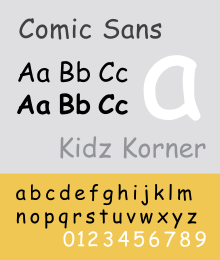
Comic Sans: Satan's Typeface


'The written word endures, the spoken word disappears…'

-Neil Postman

Typography is a modernist's obsession. In it's most basic form, it is a form of illustration, the craft of endowing human language with a durable visual form. Type is what language looks like and typefaces are a visual format for language. The art of typography is not just in the letter forms themselves but also in the way they encode meaning through pace, intonation and emphasis.

Typography has a significant chronology dating back more than 450 years, but in order to fully understand the chronology of type and the cultural shift from oral to written communication one must look all the way back to Ancient Mesopotamia in 3200BCE, an area of the middle east widely regarded as the cradle of Western Civilisation. Western scholars and occidentalists of the time adapted the pictorial Proto-Sinaitic script of the Mesopotamians, to form the foundation of western type.

The Mesopotamians pioneered in taking what was normally reserved as an oral tradition and made it a written one, a process that over time that was adopted by other cultures and forms the basis for western alphabets and written language. The development and acquisition of a durable visual  form of language was driven by the desire for trade and commerce and development still is today.

Typography and letterform has always been influenced by the technology of the time and a significant development came in 1450 when Johnannes Gutenberg created the woodblock printing press, giving birth to a range of new type faces. The creation of the printing press was motivated by the proliferation of organised religion and the desire of churches to print more Bibles.

The next major step in the evolution of type was in 1870, when William Foster introduced the Education Act, making education compulsory for all in the United Kingdom, when beforehand, education was a luxury for the privileged few. Education proliferated the need for printed word, as the printed word is key to the process of education, but it was the establishment of The Bauhaus in 1919 by  Walter Gropius and other early modernists that brought together the creative minds of the time with industry and commerce, birthing a design culture. The industrialisation of type further proliferated the
printed word and in 1957 Max Miedinger set out to design a new sans-serif typeface born out of the need to create a utilitarian, neutral typeface reflecting a modernist perspective. This is where Helvetica comes from. Helvetica reflects the consumer culture, industrialisation and commercialisation of the post-war world.

This lecture has given me a greater understanding of type and how to apply it effectively, the differences between modernist typefaces and the connotations each one holds.Typographical design is not an area I'm overly familiar with, so the lessons learned in this lecture should prove valuable should I work in a graphic style in the future for my animations. We touched upon the history of Swiss Typefaces, one of the staples of Modernist design philosophy, which I found to be interesting. While I think of myself as quite a figurative animator, I am open to more abstract ideas, Typographical animation being one of them. Even so, this lecture should prove useful in the future, especially on more commercial ventures.

Study Task 2: Reading and Understanding a Text: To What extent could contemporary animation be described as Postmodern?

The question I have chosen for this CoP task is...

To what extent could contemporary animation be described as Postmodern?

To better understand the topic I have been reading journals on the subject of modernity and postmodernity. For this task I have condensed part of a journal by Terry Barrett on this very topic titled 'Modernism and Postmodernism: An overview with art examples.'

Modernity and Postmodernity in art are best understood in relation to modernity and postmodernity in general cultural history. The age of modernity began with the Enlightenment and it was Isaac Newton that championed the belief that through science the world could be saved.  Rene Descartes and later, Immanuel Kant shaped the age intellectually, believing that through reason they could establish a foundation for universal truth. The major movements and events of modernity are democracy, capitalism, industrialization, science, belief in freedom of the individual and urbanization.


For postmodernism however, there is no unifying theory, as there are many contenders putting forth contentious ideas. Proponents of postmodernity symbolically date back to 1968, with the riots in Paris in which students demanded radical changes to what they perceived as an elitist European University system. Postmodernism is better described as anti-modernism, as it does not merely follow modernism but also challenges modernist assumptions and conventions. Postmodernists see modernity as the oppression of ‘peasants’ under ‘monarchies’, or in a more modern context, the oppression of workers under capitalist systems or the oppression of women in the social consciousness.  The postmodern argument is, in summary, the belief that modernity leads to social practices and institutions that legitimise domination and control by an elite few over the many.

I have also picked out five key quotes from the journal piece that I believe explain the subject. 

'Isaac Newton championed the belief that through science the world could be saved.'

'Political leaders of modernity also championed reason as a source of progress in social change, believing that with reason they could produce a just and egalitarian social order. Such beliefs fed the American and French democratic revolutions, the first and second world wars, and the thinking of many today'.

'Whereas modernity is influenced by the rationalism of Newton, Descartes, Kant and others, postmodernity is influenced by philosophers such as Fredrich Nietzsche, Martin Heidrigger, Ludwig Wittgenstein, John Dewey and more recently Jacques Derrida and Richard Rorty, who are skeptical about the modernist belief that theory can mirror reality.'

'Karl Marx and Sigmund freud also undermined the modernist belief that reason is a source of truth  by identifying economic forces above the surface of society and the psychological forces below it that are not bound by reason, yet are powerful shapers of society and individuals.'

'Postmodernists stress that facts are simply interpretations, that truth is not absolute but merely the construct of individual groups, and that all knowledge is mediated by culture and language.'

Wednesday, 21 October 2015

Study Task 1: Animation Analysis Exercise


For this analysis I will be comparing and contrasting some of the themes and motifs present in two pieces of animation, Director Peter Folds' A Short Vision and Stan VanDerBeek's Science Friction. Though the two short films differ greatly in terms of form, genre and the way in which they use visual language, there is some thematic crossover and interesting parallels to be made.

Aesthetically, while radically different they both retain prominent 1950s iconography, which is integral to the intended reading of both films. Fold's film plays with genre in order to subvert audience expectations, presenting us in the opening few minutes with what seems like your standard storybook setup, complete with a voice-over narration that wouldn't seem out of place in an episode of Jackanory. The director uses an inclusive visual aesthetic in order to communicate his message to a mass audience, foreshadowing the horrors of a potential nuclear war by staging it in the context of children's storybook.

VanDerBeek's film takes a different approach and is of another genre entirely, instead taking the form of an surrealist experimental cut-out animation with a deep ideologically charged subtext satirising the political climate of 1950s. Cold War escalation and the space race is depicted in VanDerBeek's film as a sort of, to put it in the crudest possible terms, international 'dick-measuring contest.' Phallic parallels can be drawn between the use of large skyscrapers and space rockets as measurements of power.

VanDerBeek draws parallels between the power-politics of the Cold War and attitudes towards gender in the 1950s (a time with a very male-dominated society) and perceived insecurities with masculinity. Though imagery is intentionally suggestive rather than concrete a lot of what I have taken away from viewing this film can be taken as my interpretation and not necessarily what the author intended. Nevertheless, from the opening few minutes of Science Friction VanDerBeek seems to equate the power plays between east and west to a strongman contest, where two countries are flexing at each other from afar, fueling each other's insecurities over their capability leading to an arms/space race. In a way this is played for laughs, but it serves as a perfect allergory for the mindset of the US and USSR during the height of cold war tensions.

A Short Vision also effectively plays upon the attitudes of the time, mainly the social paranoia of Americans in the 1950s. The audience is not explicitly told what the shape in the sky is at the beginning which plays upon the social and political uncertainties of the times. The intonation of the voice-over narration in A Short Vision seems catered to a younger audience, but the language used by the narrator at the beginning to describe the shape in the sky sets an unsettling tone, describing it as seeming 'small at first', but also 'big', as 'powerful' but 'noiseless'. These contradictory descriptives effectively create unease in the viewer and establish the dogma for the rest of the short film.

Everything seems designed as a contradiction. While the film is aesthetically pleasing to the eye and accessible for all ages, with the cut-out animation, storybook visuals and animal characters, yet the subject matter depicted is genuinely horrifying and graphic, disarming us to catch us off guard. By juxtaposing what is conventionally a universally accessible genre in visual language with shockingly graphic subject matter to get a point across, the audience is more likely to take away the message as intended by the director.

A Short Vision is a success. The film was shown on The Ed Sullivan Show back in 1956 and gained mass-media attention for it's shocking depiction of Nuclear Weapons being used on civilian populations just over a decade after the United States dropped the A-Bomb on cities in Japan, killing upwards of 250,000 civilians. Peter Fold's graphic depiction of a nuclear attack stood in stark contrast to the rest of the media's depiction at the time. In the 1950s the incredibly Conservative mass media was fiercely unquestioning of the sanitized narrative regarding the nuclear arms race being put forth by the elites running America, which is part of the reason it is so effective. The film uses a wide repertoire of visual language to subvert commonly accepted societial assumptions regarding the effects of nuclear weapons, making it both subversive and easily accessible for mass audience consumption.

VanDerBeek's film, while effectively communicating it's message to those literate in more abstract forms of visual language, fails to ignite meaningful conversation in it's audience compared to Folds' work, due to it's deliberately obtuse nature. But this is to be expected as both films were created with completely different audiences in mind. Folds' with the prime-time television audience in mind and VanDerBeek with the art world at the forefront of his.

Sunday, 18 October 2015

Context of Practice Lecture: Visual Literacy- The Language of Design

'Life was much easier when Apple and Blackberry were just fruits.'

Visual communication, in it's simplest terms, is the process of sending and receiving messages and information using type and image. It is based on a level of shared understanding of signs, symbolic gestures and objects. For visual communication to work there must be a common tongue shared by creator and audience. Without an agreement as to what certain sign and symbols mean across a range of social and cultural contexts, Visual Communication cannot exist. These conventions are built from a foundation of universal and cultural symbols.

Images can be read and Visual Literacy is the ability to interpret, negotiate and construct meaning from information presented in the form of an image. Symbols are learned and manipulating them effects meaning. Depending on the cultural or societal context symbols have multiple interpretations, which is why its is important to clarify to prevent confusion. Being Visually Literate requires a certain level of awareness of the relationship between Visual Syntax and Visual Semantics.

Visual Syntax is the pictorial structure and visual organisation of elements within an image, representing the basic building blocks of an image and how we read it. Composition, framing, lighting etc, all of this has an effect on Visual Syntax.

Visual Semantics refers to the way an image fits into a cultural process of communication, including the relationship between form and meaning and the way meaning is created through different social and cultural ideas.

Semiotics is the study of signs and sign processes such as likeness, analogy, metaphor, signification, designation, indication and communication. Though the word is usually associated with linguistics, Semiotics also involves the study of non-linguistic sign systems.

Semiotics= Symbol, Sign, Signifier

Visual Synecdoche is a term applied when a part is used to represent the whole or vice versa.

Statue of Liberty > New York
London > Big Ben

A Visual Metonym is a symbolic image that is used to make reference to something with a more literal meaning.

Yellow Taxi > New York

A Visual Metaphor is used to transfer the meaning from one image to another.

Big Apple > New York